

Production Points

PR Brochure and Company Newsletter Production and Creation Points


PR Brochure and Company Newsletter Production Points

POINT
1
Decide a concept and set your priorities

When creating printed products such as PR brochures, magazines and company newsletters, there are several things to think about. First, set a target that is in line with your purpose and objectives, and draw up a concept.
You should then clearly define the priority order for news and articles you want to communicate to the audience.
There are several factors that can lead to a PR brochure, magazine, or company newsletter that makes people want to read it and that more effectively communicates to the audience. These include having a clear balance between the images, article volume, and layout., for example making higher priority elements bigger, and lower priority elements smaller.
POINT
2
Take great care with the text
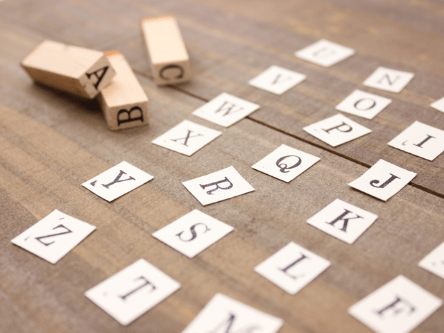
You should keep in mind 3 elements that can help you produce a PR brochure, magazine, or company newsletter that more effectively communicates to your audience. These include ease of reading the text (readability), ease of recognition (visibility), and having few misreadings (legibility). You should also take great care with the elements used, such as the font, character size, thickness, character spacing, and line spacing.
Of course, if your target readers consist mainly of elderly people, you should avoid using small text. But even if your target audience isn’t the elderly and you use smaller text, you should choose fonts that let your audience easily read the text and numbers. Even with character and line spacing, you should prioritize ease of reading over appearance.
POINT
3
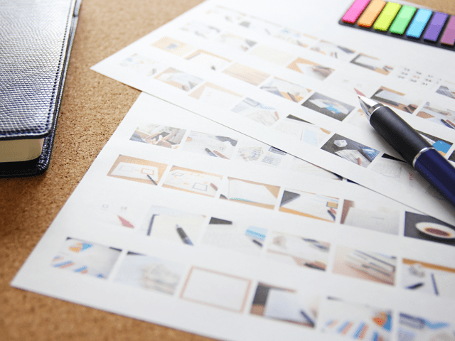
Unify the image and tone of your photographs
With PR brochures, magazines, and company newsletters, the content has a big impact on the impression given to readers.
In addition to elements such as the size and layout, it’s important to keep in mind a unified feeling in the photographs and pictures used. This includes thinking of a concept and image for the whole publication, having unified photographs with similar tones, and adjusting pictures using photograph processing tools.
POINT
4
Repeat the design

Repeating elements in a design is one important technique for making content that is easier to read and has better conveyed messages.
When making the page layout, repeatedly using illustrations, photographs, colors, and motifs that match the image of your book on each page can provide several benefits. These repeated elements can more effectively create uniformity and a sense of unity, as well as make the publication easier to read, and assist readers with proceeding through the book.
POINT
5
Think of how you'll guide the reader's eye

When creating easy to see content, it is important to keep in mind the movement of your readers’ line of vision.
For horizontal text, the reader’s line of vision starts at the upper left of the page, and then moves towards the bottom right. For vertical text, readers will move from the upper right to the bottom left.
You should also imagine how you will guide the readers’ line of sight and let them proceed reading through the page. For example, it is often said that horizontal gives a stronger impression for text with high volumes of information, and that vertical gives a stronger impression for when you have little information on the page.
POINT
6
Make everything uniform
Unifying elements such as the text and photographs based on set rules is essential for creating page layouts that are well-organized and beautiful.
Using a square-block grid as a guide, and placing elements in accordance with that guide, can let you construct layouts that are unified.
However, using exactly the same layout for all pages is simply not that interesting. So creating unity with some added variety depending on the information you want to convey and depending on the pages themselves is essential for creating content with high usability.
POINT
7
PR brochure and company newsletter production process
Here we explain the production process, from the quotation to delivery after first receiving your inquiry.
Please look here for details on the production process.
POINT
8
Production Cost Examples
The reference prices listed here for each medium are rough estimates. Please use them as a reference as you consider our services.
Please look here for information on production price examples.