

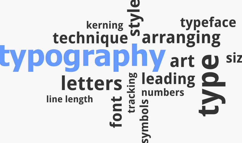
Typography
What are design basics and typography?
Introducing Fonts that
Can be Used for Free
Typography is an important element that influences the design.
Learning the basics of typography helps you improve communication with your designers.
What is typography?
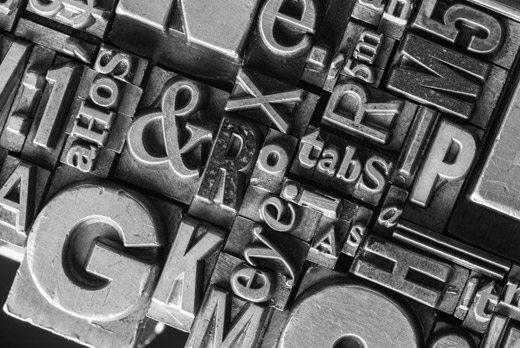
Typography originally referred to work that involved adjusting the appearance of character typography in letterpress printing, including spacing between lines, the size, and layout, as well as arranging things to be visually appealing and easy to read.
In the modern era, typography refers to all actions to arrange text in a visually appealing and easy to read manner, including font type, size selection, and character set, as well as methods for treating text as a part of design expression.
Here, we explain typography as a technique for arranging text.
Difference Between Font and Typography
Font refers to a set of text data that has been designed with the same theme.
A font is an element used in typography.
“Format” is often confused with “font.” However, format refers to the style of the character text.
Typeface
Text Style Classification


Font
Products that package text of the same design


Typography
Design techniques that use fonts as an element


Types
There are fonts for Japanese typeface and Western language typeface. Popular Japanese typeface fonts include Ming and Gothic.
Ming has inflection in the lines, and has embellishments called scales, so it is used when wanting to give off a sophisticated impression.
The lines are also delicate, so it doesn’t often tire users’ eyes when read.
On the other hand, Gothic has consistently thick lines with no embellishments, so it is used when wanting to express strength and improve visibility.
Western language typeface has fonts such as Serif and Sans-serif. Serif, with its thin lines and embellishments, corresponds to Ming in Japanese typeface. Sans-serif, with its set, simple lines, corresponds to Gothic in Japanese typeface.
Examples of Japanese Typeface
Typeface
Font
Ming
MS Mincho,
Ryumin, etc.
Gothic
Hiragino Kaku Gothic,
Yu Gothic, etc.


Examples of Western Typeface
Typeface
Font
Serif
Caslon
Palatino, etc.
Sans-serif
Helvetica
Gotham, etc.


Basics of Character Sets
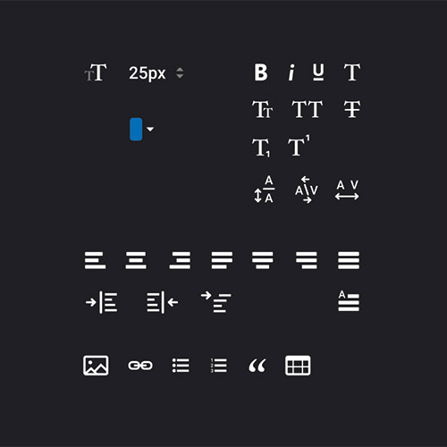
Character sets are a basic technique of typography.
The objective of using character sets is to adjust the character spacing, line spacing and size, and increase readability.
By knowing the basics of character sets, you will more clearly understand why some designs are hard to read, which is useful knowledge when making improvements.
1
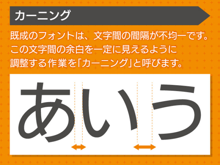
Kerning Work
With existing fonts, the spacing between characters is uneven. Kerning refers to processes that make the space between characters look more fixed. By implementing kerning, you can adjust characters to be easier to read and more visually appealing.
To use kerning effectively, you need to look at how well the characters go together rather than using numerical values to fix the character spaces. Just like with the text, even if you reduce the intervals, there are times when those intervals are too empty depending on the character combination, so adjusting by using your eyesight is more reliable.
By turning the characters upside down, you can more easily spot unnatural spacing.
2
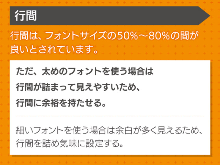
Adjust Line Spacing
For line spacing, 50% to 80% of the font size is considered good. The optimal line spacing changes depending on elements such as the line width, number of lines, font, and size. While adjusting the text, look for line spacing that is easy to read.
To effectively balance the font and lines, you should consider the weight of the font’s appearance. When using thick fonts, the lines often look jammed together, so give more space between lines. On the other hand, using thin fonts makes it appear as if there is a lot of extra space, so aim for visually pleasant line spacing and adjust things as needed, including setting the line spacing to be closer together.
3
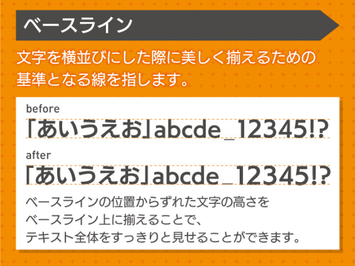
Adjust the Baseline
A baseline is the standard line for making characters visually appealing and even when lined up horizontally.
To effectively and smoothly adjust the baseline, you should know which characters tend to fall out of alignment, such as the underscore character. When you find symbols that are out of alignment, you should keep baseline adjustments in mind.
10 free fonts that can be used for business
Here, we introduce some free fonts that can be used for business purposes. Design beginners will find them easy to use.
*These fonts are free and available for business use as of the publishing of this article on April 2021.
*The business usage conditions differ depending on the policy of each font.
Free Japanese Fonts
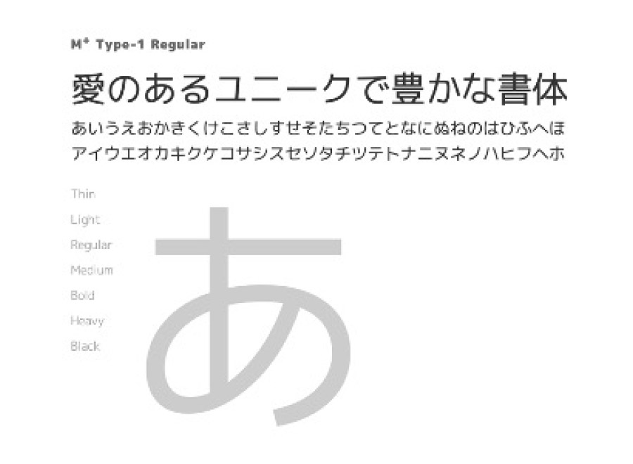
1
M+ FONTS
Gives off a round and gentle impression.
This font is easy to use in any situation.

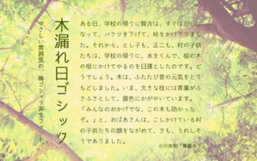
2
Komorebi Gothic
Derived from Ume Gothic, this stencil font gives off a nostalgic mood.
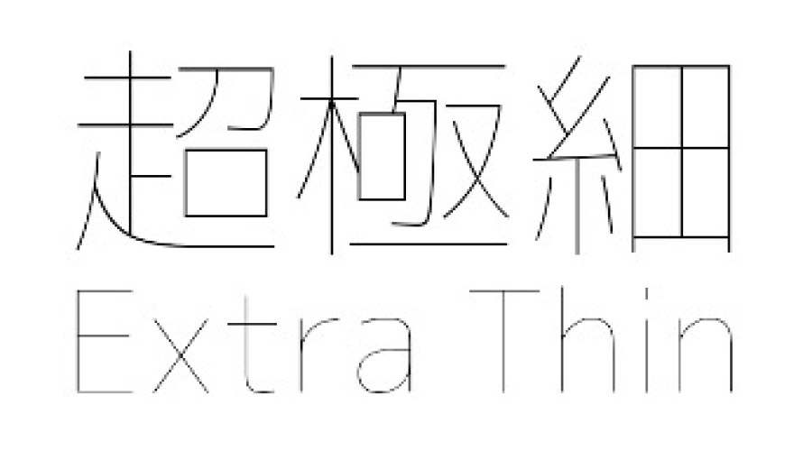
3
3. Chogokubozo Gothic Typeface Font
This extra-thin gothic font has a clean, fresh and neat feeling, and looks as if it were written in ballpoint pen.
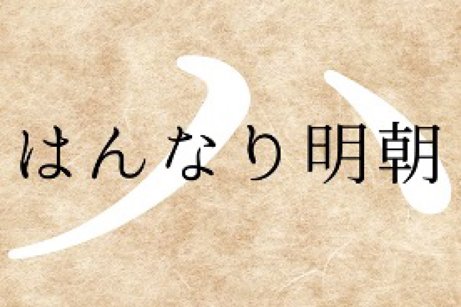
4
Hannari Ming
This font has a soft and gentle feeling. A perfect fit for designs with a Japanese feel.
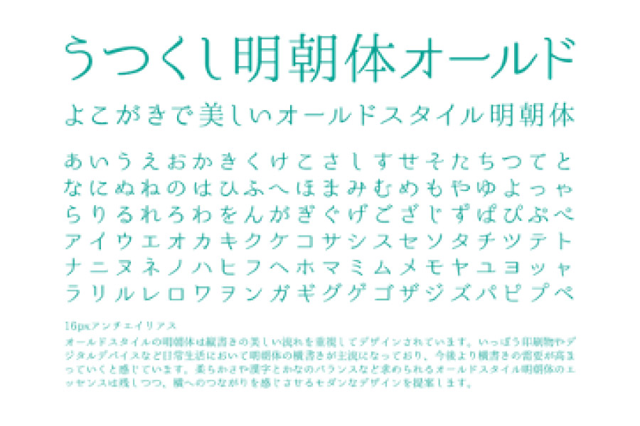
5
Utsukushi Ming Typeface Old
A Ming typeface with a retro and modern flavor. A perfect fit for designs aimed at women.
Free English Fonts
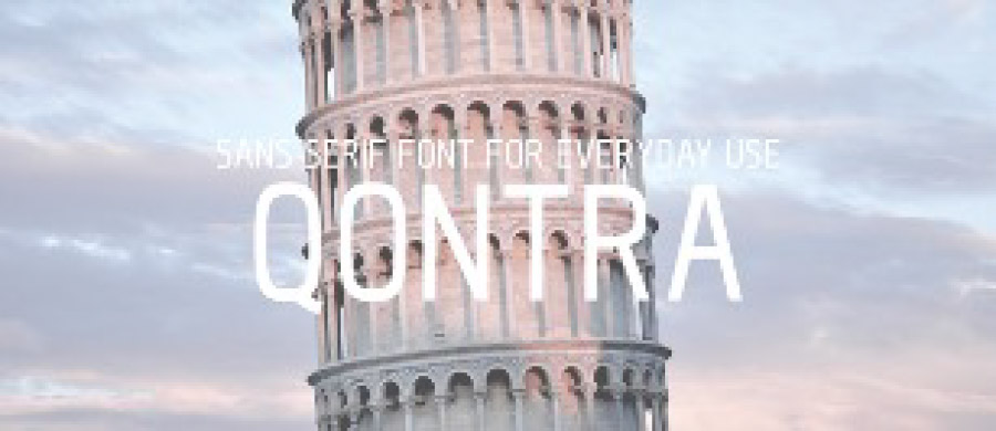
1
Qontra
This vertically long and simple Sans-serif typeface is easy to use in logo designs.
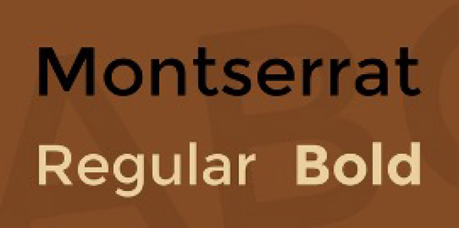
2
Montserrat
This font with a classical mood is easy to read. You can choose from 2 kinds of weight.
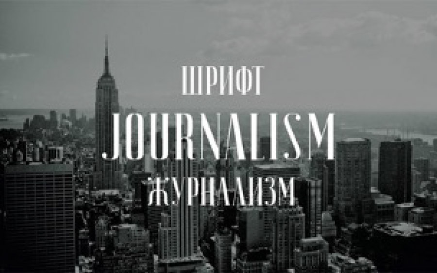
4
Journalism Serif Font
This Sans-serif font has narrow character spacing and gives off an elegant impression.
5
Foundry Font Kit
This Sans-serif font has narrow character spacing and gives off an elegant impression.