Color Scheme Design
COLOR SCHEME
Useful for color scheme design!
Basic Knowledge and Free Tools
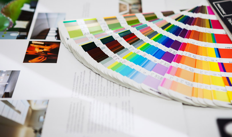
Color schemes do not just create the image for the design. They are essential elements that act on people’s emotions and influence the effectiveness of a design.
If non-designers have knowledge regarding color schemes, they can make better presentation materials and documents, as well as make more informed judgments when ordering and judging designs.
Learn Color Scheme Basics
Being aware of even the basics of color design has a big impact on how ease a design is to look at, as well as its overall quality.
First, let's start by learning about some basic terms and tools.
Basic Color Scheme Terminology
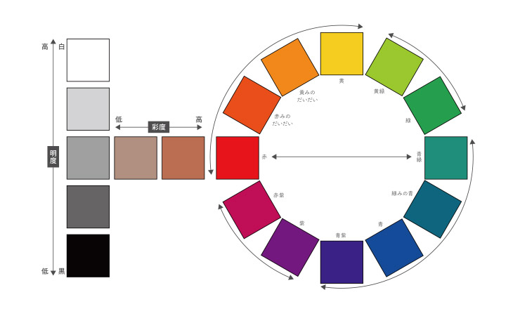
3 Attributes of Color
This term refers to the 3 qualities that color has – hue, brightness, and saturation. All colors are made from these 3 elements.
Hue
This term refers to the tone and shading with colors such as red, blue, and yellow. The color circle arranges the differences in color tones in a circle.
Saturation
Saturation means how vivid a color is. More vivid tones are referred to as “high saturation,” and faded tones are called “low saturation.”
Brightness
This is how bright a color is. Very bright colors appear as almost white, and colors with low brightness appear as almost black.
Complementary Colors
Combinations of colors that are in positions facing each other in the color circle. By combining complementary colors, you can make color schemes that have strong contrast.
Similar Colors
Combinations of colors that are in nearby positions in the color circle. By combining similar colors, you can create color schemes with calm tones.
Basic Color Scheme Rules
1
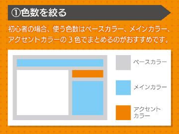
Narrow down the colors used
Designs that increase the number of colors beyond what is necessary tend to be too complicated and difficult to look at.
For beginners, we recommend settling on 3 colors to use – a base color, a main color, and an accent color.
2
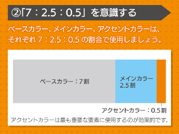
Keep "7 : 2.5 : 0.5" in mind
Use your base color, main color, and accent color in a ratio of 7 : 25 : 0.5.
Using accent colors for the most important elements is a very effective technique.
3
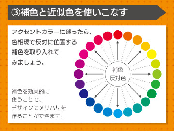
Efficiently use complementary colors and similar colors
If you’re not sure which accent color to use, incorporate a complementary color located opposite of the color wheel. By effectively using complementary colors, you can create balance in your design.
If you want to create well-coordinated color schemes, we recommend incorporating similar colors located near each other on the color wheel.
4
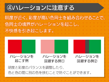
Pay attention to variation
By combining colors with similar brightness and high saturation, you create halation in the boundaries between colors, and cause discomfort.
By adjusting the brightness and saturation balance, and by inserting different colors between colors, you can prevent halation.

5
Keep color effectiveness and image in mind
The colors you use will differ depending on your target audience and the impression you want to give.
Understand psychological effects and image that a color gives, and work on a color scheme that keeps your design objectives in mind.
5 Recommended Color Scheme Tools by Objective
Color schemes give off various impressions and effects depending on the color combinations used.
Simply using a number of colors does not always make for an effective design.
Color scheme tools are like samples of color scheme patterns published on the internet.
You can use them as suggestions when you are worried about what to do with your color scheme.
These free color scheme tools are also used by professional designers in their designs. With them, you have more color schemes to draw from.
1
When you want to search for color scheme patterns by a key color
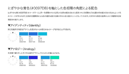
Color Scheme Sample Book
When choosing a key color that will be your base, this site suggests hue information and color scheme patterns of 2 colors to 6 colors. You can use the color wheel to check the position of 2 colors and any changes in impression, so we recommend it to design beginners and non-designers who want to develop a sense for hues.
2
When you want to simply look for colors that go well together
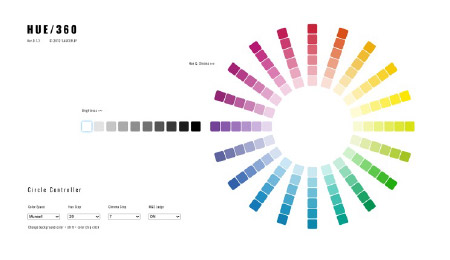
HUE/360
Selecting key colors that will be your base by using the color wheel narros down color schemes that go well together, and when selecting colors you can check the color code. The displayed color code can also be converted to RGB.
3
When you want more color schemes to draw from
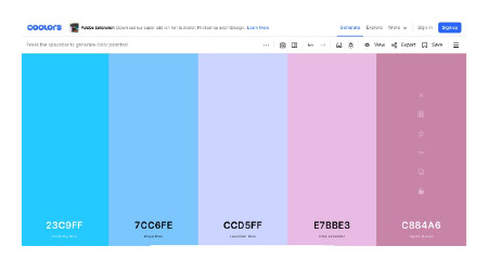
coolors
Pressing the space key displays color pallets generated at random. In addition, you can use the tool bar to adjust the tone, saturation, and brightness of your color scheme, and to capture what you have created.
4
When you want to look at web design color scheme examples
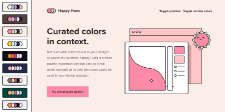
Happy Hues
The pallets you select on the left side of the screen will be reflected in the site design displayed on the right. On the bottom of the page, you can confirm and copy the color codes used. You can also use color distribution as a reference.
5
When you want to extract color schemes from a photograph
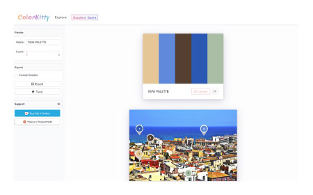
Color Kitty
This site lets you automatically extract color schemes from an uploaded image and create a color pallet. This tool can give you hints for coloring when expanding and designing and image from a photograph.
Color Scheme Tools by Number of Colors
Color scheme beginners can create color schemes with a unified impression by limiting the colors they use.
Search for color schemes based on the number of colors you want to use – 2 colors for a simple and calm impression, the basic 3 colors (main color, base color, and accent color) and 4 colors for expanding the breadth of your design.
Tools that let you search 2-color color schemes
1
Tools that let you adjust and search for color schemes yourself
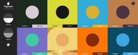
Pigment
This tool lets you adjust the pigment and lighting and search for color schemes that suit the image you have in mind.
You can also select photographs to search for color schemes of colors that go well together.
2
Random suggestions for color schemes
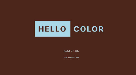
HELLO COLOR
Clicking randomly displays color schemes with 2 colors. Besides the 2 colors that make up your base colors, it also suggests accent colors and gradation.
3
Choose by your favorite colors Create a color pallet
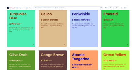
Khroma
Choose 50 or more colors you like and then choose 2 colors that go well together among colors picked out by an A.I., and create a color pallet. You can confirm the appearance of the background, text color, and gradation.
Tools that let you search 3-color color schemes
1
Stock of color schemes derived from art photographs
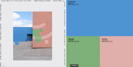
Found Color
This site extracts colors from artistic and simple photographs and compiles them into 3-color color pallets. It’s useful for providing suggestions when you search for unique color schemes.
2
Suggestions for color schemes with matching colors from the color wheel
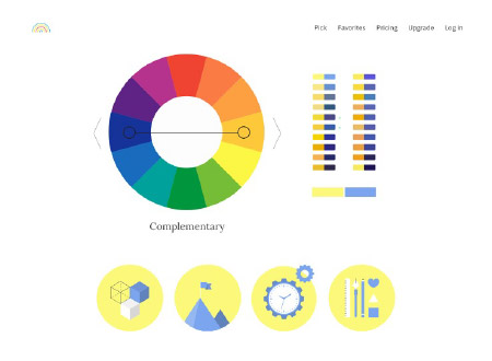
COLOR SUPPLY
This tool suggests combinations of similar colors and complementary colors based on the color wheel. You can check color schemes using icon illustrations. You can search for 3-color, 2-color, and 4-color combinations.
3
Random suggestions for 3-color combinations
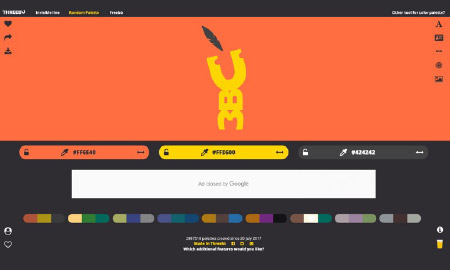
RandomMaterial
Palette Generator
Clicking randomly displays 3-color color scheme patterns. You can check color schemes through text, logos, and figure illustrations.
Tools that let you search 4-color color schemes
1
Simple 4-Color Color Scheme Examples
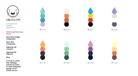
LOLcolors
This site is a collection of color scheme examples. It includes color schemes with pop images and gentle images that are good to use for designs aimed at women or children. Placing the cursor displays color codes.
2
Simple searches for 4-color color schemes
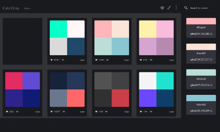
ColorDrop
This is a simple color scheme sample site that displays 4-color color scheme patterns in a grid shape. Each pallet has its color code and rgba value displayed.
3
Suggestions for color schemes with well-balanced colors
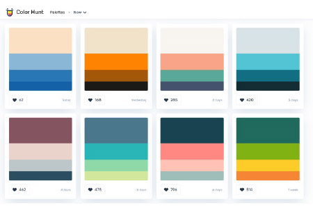
ColorHunt
This site updates its 4-color color pallets almost every day. It suggests color schemes with well-balanced colors, so you can use it for ideas on how to allocate your main colors, accent colors, and sub colors.
Books for learning color scheme basics
We recommend studying with books that teach color scheme patterns from example works, in order to learn color scheme rules and basic color knowledge.
Here, we introduce color scheme books recommended for non-designers.
1
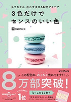
Look and understand, color scheme ideas you can choose easily Good colors that can be used in sets of 3 (2020)
Design beginners can understand color allotment balance and design image with this book, thanks to the design examples of all color schemes, as well as the color area ratios published within. Recommended for both design beginners and non-designers.
2
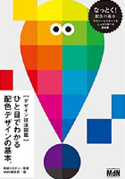
[Design Technique Blueprints] Color scheme design basics that can be understood at a glance (2020)
With this book, you can thoroughly learn both color design patterns and design samples, as well as color scheme design basics such as concrete color scheme examples from basic color scheme rules, and choosing color schemes that match the image you have in mind.
3
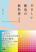
Beginner’s Color Scheme Textbook [Revised Edition] (2008)
This book takes the color rules which are the minimum necessary for design, and carefully explains them in simple language and with easy to understand illustrations. It is ideal for people who will learn design.
4
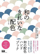
Beautiful Japanese Color Schemes A book of color scheme examples chosen by key colors (2018)
With this book, you can learn about Japan’s traditional colors and color schemes along with the historical background and culture. It is packed with images, visuals, and color scheme patterns.
5
Color Scheme Design Inspiration Book (2019)
You can find color scheme patterns by the image you want. It has many examples by theme, so this book is useful for sharing the image you have for your design with designers.


