Layout Basics
Layout Basics!
Can be used for creating materials Thinking styles and techniques

What is a layout? The purpose of layouts
Layouts involve working on the arrangement and allocation of elements. The objective of a layout is to convey information in an easy to understand form, by organizing that information and visualizing hierarchies in the design.
Effective layouts display strong communication skills, even in business documents and presentation materials.
Complicated materials that cannot be understood even if you read them thoroughly can be changed to materials that can share important information quickly just by looking at them. This can be done by keeping in mind some rules for creating layouts.
Here we introduce how to think of layouts that are useful when creating materials for businesspeople, as well as some basic layout rules.
Layout Thinking Methods

The important thing for creating layouts is to organize the hierarchies and relationships between information. Making a blueprint involves creating a priority order. You can organize information through the following process.
1
Discovering Elements
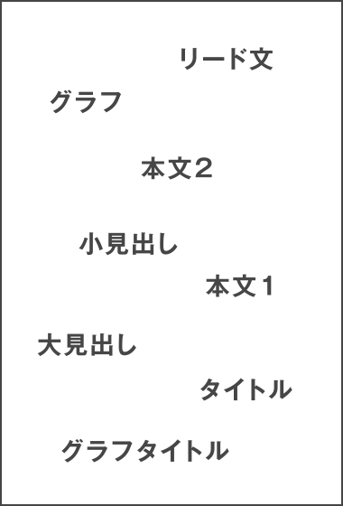
Discover all of the elements of the design, such as the photographs, data, titles, big headlines, small headlines, and text placed in the materials.
We recommend using sticky notes to organize these elements so that the order can be easily modified.
2
Creating Groups
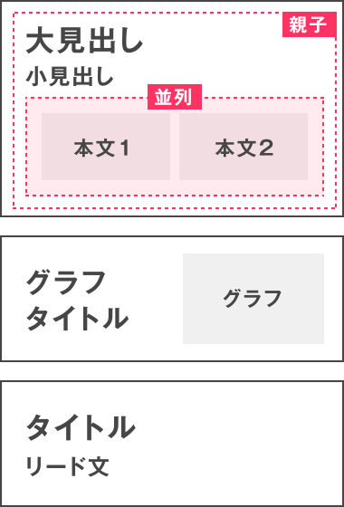
Group all similar elements. Here, you can rearrange information while keeping mind which elements can be arranged vertically, such as, for example, Headline 1 -> Photograph 1 -> Text 1, and which information you want to convey to be arranged in a line, including the opening date and deadline.
3
Making a Story
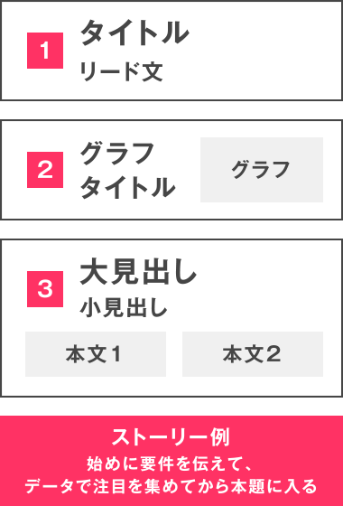
By rearranging groups you can create a story.
You can complete your blueprint by rearranging elements while keeping a priority in mind, for example – What you want to communicate first – What information supplements that – Conclusion.
Layout Basics
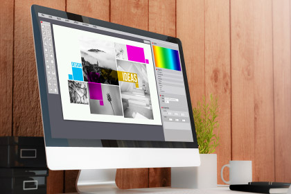
In actual layout work, you visualize the priority of information and the contrast in accordance with the blueprint.
During this process, it is important to understand the 4 major principles of design (proximity, arrangement, contrast, and repetition), as well as people’s behavior and psychology.
1
What is visual guidance?
Visual guidance refers to methods for controlling the follow of a person’s vision in order to effectively convey information.
Visual guidance is used in all kinds of everyday situations, including composing photographs and pictures, as well as advertisements and web design.
From large to small
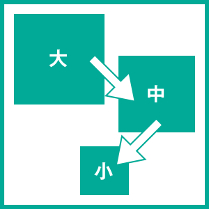
People’s lines of sight move from large items to big ones. One of the basics of materials creation is taking information that you want people to read first, such as titles, headlines and catch copy, and placing it larger to contrast it with other elements.
Z Form

A Z form is how our vision is guided when we look at paper and screens with vertically written text. The name comes from our vision flowing in a Z shape when we read vertical text – from upper left to upper right, from upper right to lower left on the opposite corner, and from lower left to lower right.
N Form

An N form is when our vision is guided when we look at vertically written Japanese text. Our line of sight flows in an N shape – from upper right to lower right, from upper left on the opposite corner, and from upper left to lower left. Along with the Z form, it is a basic shape of visual guidance. It is often used in Japanese newspapers and magazines.
F Form

This method involves repeating the movement of the line of vision downward from the left end to the right end. Many websites use the F form of visual guidance for their layouts.
2
What is proportion?
Many designs that people feel are pleasant are created based on set ratios.
Even in materials creation, laying out text and charts based on this ratio lets you create designs that give off a more pleasant and sophisticated impression.
Golden Ratio
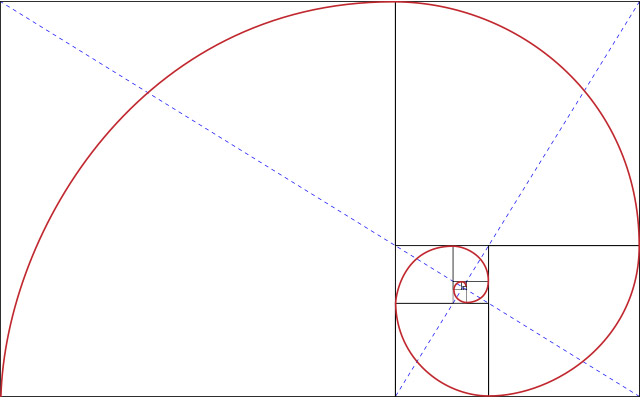
The golden ratio refers to a vertical and horizontal ratio of 1 : 1.1618. It is considered the ratio that people think is most visually appealing. This ratio has been used in old paintings and architecture such as the Mona Lisa and the Triumphal arch.
A 1 : 1.1618 rectangle referred to as the “golden rectangle” is used when applying the golden ratio to layouts. Making the largest square within the golden rectangle forms another golden rectangle in the remaining rectangle space. By covering the largest square in the same way, it draws a smooth helix that connects each opposite angle.
By deciding on the placement of design elements and white space using this straight line and curved line as a reference, the layouts become more pleasant for people to look at.
Silver Ratio
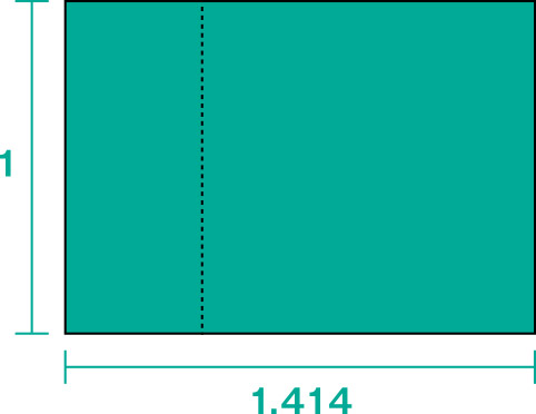
“Silver ratio” refers to a vertical and horizontal ratio of 1 : 1.414.
This ratio is used in various creations, such as the Five Storied Pagoda and other architecture, as well as for characters that are very familiar in Japan. Japanese people in particular feel stability and beauty with this ratio, so it is called the “Japanese ratio.”
Rule of Thirds
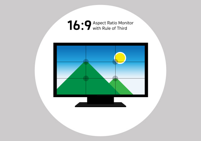
The rule of thirds is a layout method in which 2 vertical and horizontal lines each are drawn at equal intervals, and the points where the vertical and horizontal lines intersect are used as a general guideline for placing elements.
It was originally used for photography composition, but it is also useful for creating balanced and visually appealing layouts for printed paper and online screen design.


