4 Principles of Design
A review of the 4 design principles and basic terms
which are the minimum
that all clients should know
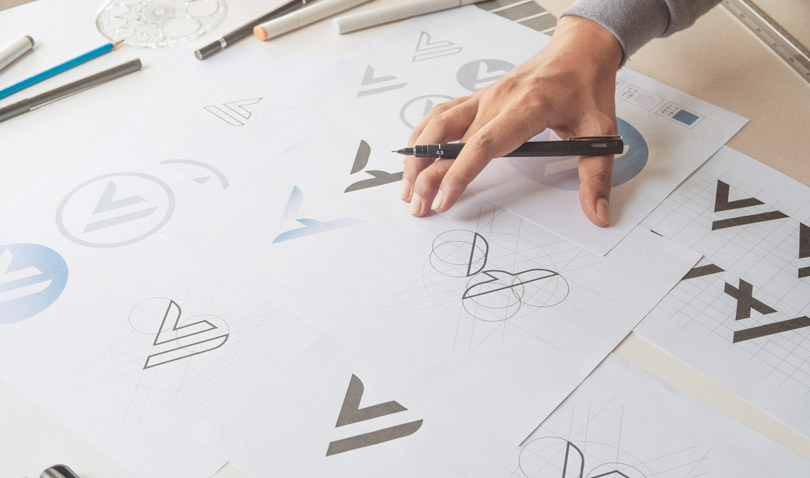
Many designs that can be grasped with intuition and sense are created in accordance with certain principles and rules.
Understanding basic design rules helps make your instructions to designers go more smoothly, and increases the quality of the end product.
What are design basics and the 4 principles?
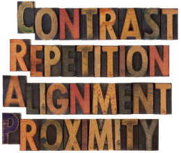
The 4 principles of design are 4 basic elements that organize design elements and convey them in an easy to understand way. They are proximity, alignment, repetition, and contrast.
Keeping these 4 points in mind leads to more effective communication regarding the points of the design that need to be improved. These elements are also useful in everyday work situations, such as creating planning documents.
Explaining the 4 principles with examples
1
Proximity
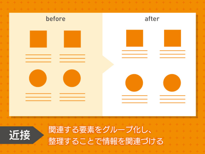
With proximity, you can link information by grouping and organizing related elements
Proximity is putting related elements near each other and grouping them.
For example, when you are introducing several products on one screen, having too much space between the product image and product name means that users cannot instantly understand the product name.
In this case, putting related elements such as product images, product names, and the catch copy near each other, as well as leaving space between products that have no connection, can lead to designs that accurately convey product information at a glance.
2
Alignment
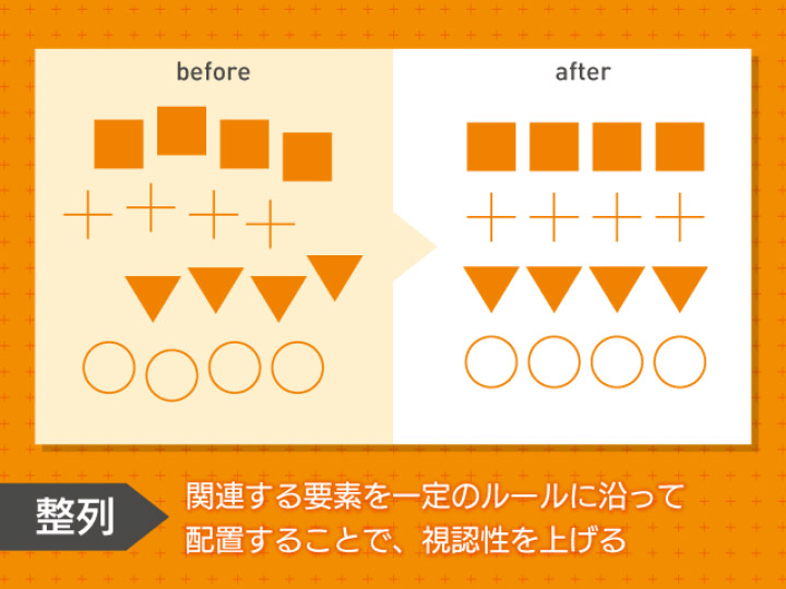
By placing related elements in accordance with set rules, you can increase visibility
With alignment, you can make the whole design easy to look at by assorting and placing elements in accordance with set rules.
Combining alignments has the advantage of making the connection between similar elements more intuitive and easier to understand.
3
Repetition
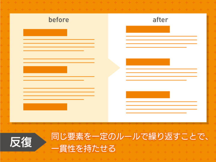
By repeating the same elements in accordance with set rules, you can create designs with a sense of uniformity
With repetition, you can create designs with a sense of uniformity by unifying the colors, fonts, and icons used in related elements.
For website designs, repeating the same themes can let users intuitively know what site they are on now.
Moreover, in designs that have repeated elements, incorporating designs that do not repeat can create effects and accentuation that emphasizes the design’s elements, and can add strength to the whole design.
4
Contrast
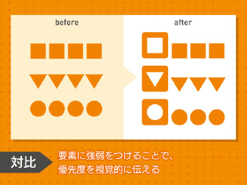
By adding stress and accents to the design elements, you can visually convey the superiority of your products and services
With contrast, you add stress and accents to the design elements, and clearly define important information visually. Typing “X% OFF” in a large font on a sales advertisement is one example of a contrast technique.
Arranging the elements with proximity, alignment, and repetition has the disadvantage of making the contrast between information weak, and having users not focusing on the information you most want to convey.
So adding balance to the elements lets you make designs that intuitively communicate the priority order of information.
デザインの4原則
1
Proximity
With proximity, you can link information by grouping and organizing related elements
2
Alignment
By placing related elements in accordance with set rules, you can increase visibility
3
Repetition
By repeating the same elements in accordance with set rules, you can create designs with a sense of uniformity
4
Contrast
By adding stress and accents to the design elements, you can visually convey the superiority of your products and services
Basic Design Terms
Here we explain design terms that non-designers will want to know when they make an order for a design.
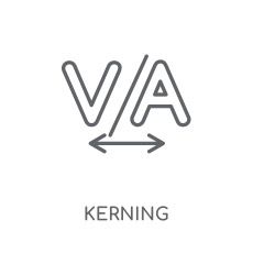
Kerning
Kerning is adjusting the spacing between text characters. It is very important in design. With fonts and typography, the spacing between characters is subtly different depending on the type and combination used, so we use kerning to adjust the spacing to be fixed.
Kerning is important work for creating pleasant designs that create positive feelings in users.
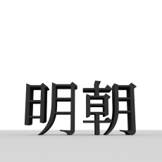
Fonts
Fonts were originally sets that unified Western language type used in letterpress printing with the same design and size. Recently, it’s become common to refer text data with the same design, such as “MS Mincho” and “Round Gothic,” as fonts.
On that note, “typeface” refers to collections of characters with a unified design, such as Mincho typeface and Gothic typeface for Japanese typeface, as well as Serif typeface and Sans-serif typeface for typeface in Western languages.
In other words, font often refers to the product, and typeface refers to the classification. Many people confuse the two, but being able to distinguish them will make your connection with a designer go much more smoothly.
Typeface
Character Style Classifications


Fonts
Products that package text of the same design


Spacing
Spacing in design is also referred to as white space. It plays an important role in element organization, creating movement for users’ line of sight, and giving users impressions of specific elements.
In our experience, one mistake that design beginners and non-designers tend make is filling the paper surface (screen) with too much information, making the important information hard to convey. Knowing how to use spacing, as well as its effects, can help you aim for a more sophisticated design.
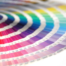
Color Scheme
Color scheme in design is work that considers color combinations while being aware of color effects and incorporating them into the design. Colors have the effect of influencing people’s emotions, and the image that a design gives off differs greatly depending on the color scheme used. In addition, color schemes have the effect of giving an impression of a strong image color for a product or brand.
To utilize the effects that colors have, you must learn about colors from various angles, including the three primary colors of light, the three primary colors, hues, brightness, saturation, color usage proportion, and the psychological effect of a color.
Books for Learning Basic Design Knowledge
Learning the fundamentals of design lets you logically discuss what a good design is, and is useful when you want to order good designs.
Beginner’s design guides are an excellent way to deepen your knowledge on the information we introduce here.
1
Books for Learning a General Foundation of Design
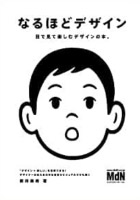
Easy to Get Design (A new design book that is fun to read) (2015)
This book explains the basic principles, rules, and processes of design using easy to understand explanations and lots of illustrations and visuals.
2
Books for learning the 4 design principles
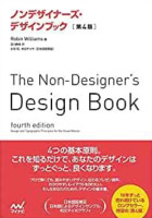
Non-Designer's Design Book (4th Edition) (2016)
This book not only teaches you the 4 basic principles of design, it is also packed with useful design fundamentals that non-designers should know.
3
Books for learning fonts
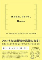
Really Using Fonts. A book on utilizing fonts for design layouts (2019)
This book is useful for searching for optimal font examples by design objective and target audience, as well as for choosing fonts.
4
Books for learning spacing design
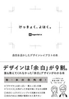
It’s a blank space after all (2018)
This book lets you learn about spacing from a large variety of design examples, making it useful for both professionals and non-designers.
5
Books for learning color schemes
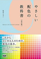
Beginner’s Color Scheme Textbook [Revised Edition] (2008)
This book takes the minimum necessary color rules, and explains them with simple writing and illustrations that design beginners can easily understand.
